I've been meaning to talk about the art pipeline for A Valley Without Wind for a while now. So here we go!
For those curious on how I'm doing the art, it's a pretty huge pipeline:
- Characters and similar are rendered in Poser Pro 2010 at high resolution and then cartoonized in post-processing using Photoshop CS5 and a number of custom filters by Topaz Labs.
- Objects are rendered in a variety of programs, or in some cases are using photo textures as in many games, and then are run through filters by Topaz Labs, Nik Software, and Filter Forge, all through Photoshop again.
- Specifically, most of the work on actual object sculpting and painting is being done using Mudbox 2011. I did most of the art for Light of the Spire using ZBrush 4.0 (and the rest in the GroBoto 3 betas), which was great for the style of the spire ships, but for AVWW I'm only using ZBrush for the ZSphere rapid design tools, with the resulting frames being exported to Mudbox for final sculpting and painting in Mudbox.
- In terms of the plants and skies, as well as a few other things like clouds and some of the ground textures, I'm using Vue 9 Complete to do all that. I did a lot of work back in the day in Vue 6 Infinite, and before that in Carrara 6, Bryce 5, 4, and 2, so Vue is a natural progression of that for me and quite a favorite.
- To set up infinitely tilable textures, I'm using a really cool piece of software called imagesynth 2. That, plus the heal brush in Photoshop, really let me get some interesting effects. That's how I'm able to make the really complex skies from Vue tile seamlessly, and things of that nature.
- I've also taken several hundred photographs already for custom textures, and those all get processed pretty heavily in Photoshop using Topaz, Nik, and Filter Forge. A lot of times, in order to get those looking at all right I have to make several passes at them through the various Photoshop plugins, then tile it in imagesynth, then do more work in Photoshop, then have another go at it in imagesynth.
- There's also a lot of hand-editing to a lot of the images, using the heal brush or just regular brushes via my Wacom Intuos4 (small) tablet. The last Wacom tablet I had was from 9 years ago and was terrible, but I've been finding my new one absolutely indispensable and a dream to work with. Lets me do all sorts of things digitally that I could only ever do on paper in the past.
Finding an aesthetic with the right amount of detail to look painterly for the background without looking too cluttered was quite a challenge, and finding the right look that would look cartoony without being too "young" was another big challenge.
I keep all the original models and model rendering exports as source material, which makes it easy to go back and re-tile or re-filter them as needed. That's been really helpful, because I've gone through six or seven major revisions to the art to find a style that could be consistent for different kinds of objects at different sizes. For the office buildings, and buildings in general, I'm still working on that.
For the rest of the components in the scenes, I've finally got a look that has made folks go "wow" when they see the game in motion at full resolution. In the video and screenshots the trees are seeded a lot thicker than they normally would be (in most cases except really deep woods, I suppose), mostly to mask the fact that the rest of the space is kind of empty at the moment. Normally that space would be filled with interesting plants and rock formations, buildings, caves, monsters, rifts in the earth, and so on. So there's an overabundance of trees, which can be kind of overwhelming at times -- actually in the final game I plan to use that to my advantage in a few really deep woods, jungle-like sort of areas; but I wouldn't call that representative of the whole game.
There's actually a little bit of distortion on the outer edges of some of the graphics that I'm not in love with. To some extent it looks a little artsy, but it's also a lot rougher compared to the smooth, painterly inner lines. That's an artifact of the Topaz filters not being allowed (for whatever reason) to blend across transparent pixels. I intend to write them about that, and if that's something they can resolve then it should be an easy fix and I can re-filter the art that's presently in place (I keep macros in Photoshop for all the various common operations, and then hand-edit after). If that isn't feasible for them to do anything with for some reason, or if it will take too long, then I'm contemplating just edting those by hand. That would be rather time consuming, though, and I'd rather not have to spend quite that long on post-processing every last image. We'll see.
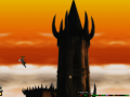
To me that's a fairly minor niggle, though, and only applies to some of the images. For the buildings, that's my next big challenge, but I anticipate having something awesome-looking next week. There are some perspective tricks that a lot of SNES games use that I think I can do using newer software in a higher resolution, to get something really exciting. It's always tricky with 3D prerendered into 2D, because the smaller it is rendered, the worse it looks -- something that looks amazing in Vue or Mudbox at full scale looks pretty lame when it's shrunk down to even 128x128.
The trick, therefore, is to keep the overall shape, shadows, color and such from the original renderings, and then simplify those down into a more broad, cartoony style so that it looks great when reduced. I'm particularly proud of how well the character and plants look with those techniques, that was quite a challenge to get right. The character, of course, needs another 5 frames added to his running animation, so I'll have to render those in Poser, post-process them using my macros in Photoshop, shrink them down, and add them to the list of in-game frames. It's nice that at least I won't have to re-render the existing frames to do that, thanks to having all the original documents.
To see the art in question, please see the full-res screenshots on our site. Enjoy!