| Posts | ||
|---|---|---|
| Perspective HUD feedback needed | Locked | |
| Thread Options | ||
|
|
Feb 17 2011 Anchor | |
|
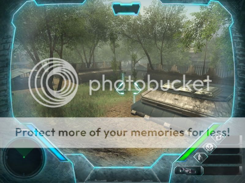
So, I've been toying with some ideas on HUD designs, and I came to the conclusion that I prefer the styles of games such as Metroid Prime, Ghost Recon AWF and Republic Commando. If you are not familiar with those games, the HUD is an actual HUD inside of the characters helmet not just random information displayed for the player. I like the immersion these traits bring to FPS so I'm running with it. Now, I like the general look that I have going but layout is proving to be a bitch. Any feedback on placement, design or other suggestions is wanted. Umm, thanks.
|
||
|
|
Feb 17 2011 Anchor | |
|
I suppose the blue bar is your shield level either way, the immersion is kinda broken due to the score, damagepoint, combo and enemies killed text. -- °w° |
||
|
|
Feb 17 2011 Anchor | |
|
Yea, those are what I'm needing help with. Mostly placement, as in where Is a good place to put that stuff. I think I may be consuming too much screen space with the radar and abilities commands. I can redesign those but I'd rather find another rout. The text (Combo, Enemies killed, score etc) will be replaced by icons, simlar to the abilities, so location is key. K, I'm trying something a bit different now. Scores will go on the left, ammo and weapon right below them, abilities will go center. This is just a mock up with a Crysis screenshot as the background. I'm tired, gonna call it a night.
Better or worse? -- Rawr.. |
||
| Mar 7 2011 Anchor | ||
|
I think it's better, it looks more professional. Although, the upper bar which contains the time in the first screenshot, looks a bit de-centered, as do a couple of other things. You should make the whole HUD symmetrical, I think that'd look better. Also, you could lighten the radar a bit more up, it looks dark right now, you're pulling the attention away from it, despite the fact that it could be an useful tool in your game. |
||
|
|
Mar 23 2011 Anchor | |
| Mar 23 2011 Anchor | ||
|
My 2 cents: As it is currently, theres way too much clutter. Taking off the score/damage/combo indicators was a wise decision, and a good first start at reducing the amount of UI. Now ask yourself, what else you can do without? what other options can you take to minimize the amount of interface taken up on screen? I'll start by telling you that the "aqua hued blur" might mess with the lighting in your game, making everything appear misty, are you sure you want to use it? You have two interesting designs not taken up on the sides of your interface, why not move the shield and health bars to fill up that empty space, giving yourself some room near the bottom center. The main factor here is that you don't want the main focus (focal point in art terms) of your game to be set on your interface, and if its grabbing more attention then the primary features of your game (ie; everything aside from interface; gameplay, objects, environment, etc), then you as a designer, have failed to deliver that immersion to your audience. A tip that may help you out in the future, if you haven't considered doing so already, is organizing a document together (not a game design document, but an interface document) on what must be displayed on your interface, and what other factors can be displayed using other design principles. Hope that helped a bit -- ::Supporting starving artists around the globe!:: |
||
| Mar 23 2011 Anchor | ||
|
If you are going to go with immersion that you are inside some form of suit/helmet, you should be able to somewhat be able to "move around" in the helmet when you scroll to the sides fast, and such to give that feeling that you are actually in something. Example: you turn around fast to the right, this would mean that you would get to see more of the right side of the helmet than the left side for a short period of time - parallalax principles. This way you will be also be able to give yourself more space for the player's field of vision while the player is still aware of the edges of the helmet like what they do in Metroid Prime. Another suggestion would be to add the shield/life meters closer to your crosshair so you can see all of this when you are actually aiming but in a way it won't reduce accuracy and field of vision. I've seen this done in several games UI, it does work. The question is, why should the player have to shift their eyes focus to both sides of the screen to identify their healt and shield levels during combat rather than have a common central area where you can aim and still see all the necessary information without blocking the field of vision during combat. This has been done in games, while in different genres it worked quite well during raids in WoW where you had curved bars close to the crosshair, it was done for a meter in Metroid Prime as well, but I can't remember too much about it. You could control when the curves are allowed to be displayed with buttons or with states when it's not necessary to see. You should change the colour of the blue meter, what if the user is somewhat colour blind, will they easily be able to distinguish the meter from the UI/helmet/shield thingy around the screen. At first I didn't even notice it was a meter, but since it's a captured screen this shield meter could already be colour coded, the lower it gets, the more it blends to another colour (easier to identify the shield level by using your peripheral instead of having to shift your eyes focus on to the shield meter during combat) You should drop Enemies killed, Combo shots and such since it's pretty much clutter the screen where you are supposed to identify potential threats which imho is a major frustration. "I got hurt because the combo text was blocking my field of vision, thus the enemy was able to "ambush" me without the intension to do so". Good luck and cheers for going into that direction. Edited by: Siphonen |
||
| Mar 24 2011 Anchor | ||
|
the 2nd one looks good an good idea would to have a 3d effect |
||
|
|
Mar 25 2011 Anchor | |
|
-More transparency on the HUD Another idea could be to remove your health bars altogether and only make them visible on screen when you lose and gain power/HP. Many games have it like that and it's a good concept imo. Edited by: Nightshade |
||


Only registered members can share their thoughts. So come on! Join the community today (totally free - or sign in with your social account on the right) and join in the conversation.