| Posts | ||
|---|---|---|
| PCZ Studios - Psychosis Screen Shots | Locked | |
| Thread Options | ||
| Feb 4 2012 Anchor | ||
|
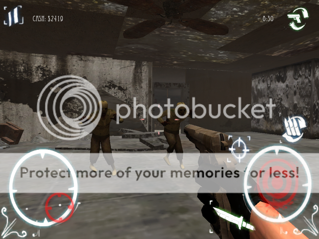
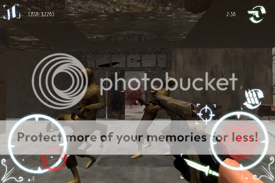
Hi everybody! We have some updated screen shots from our new game, Psychosis. We are still in the testing period, but we're finally close to finishing!
More screen shots to come! Edited by: PczStudios |
||
| Feb 20 2012 Anchor | ||
|
poor textures, poor models, poor detail, to big hud |
||
|
|
Feb 22 2012 Anchor | |
duh its obliviously made for iphone or android... think about it before posting those kind of comments I'm not a fan of the art side tho... too much brown Edited by: casf01 |
||
| Feb 26 2012 Anchor | ||
|
I looked in the the models on the PczStudios link and the characters have better detail then I'm seeing in these in game shots. I would suggest working on character colors and shading to help make the zombies stand out a bit. Also all the rooms I see look very similar. More detailed textures and even better lighting might help make things more interesting and pull the player into the experience. I know it isn't easy when watching file size and all. Especially on a phone contrast on walls floors characters will help the player understand what is going on with such a small screen. Good luck with it. |
||
|
|
Mar 4 2012 Anchor | |
|
Looks really cool - but I think you can make a lot of graphical improvements. Graphics wise it's too brown for starters. The colors melt together in a bad way. You should give the zombies more color and make the environment textures more interesting. The HUD also needs some minor tweaking. HUD Zombies Environment And last, something which I'm not sure is possible or not (might be too performance heavy): EDIT: Edited by: Nightshade |
||
| Mar 24 2012 Anchor | ||
|
Hey guys, we really appreciate all the feedback. Seriously, we do. We are taking action right now to modify certain mutually agreed upon graphical issues. Niteshade - Thank you very much for making the valid points. Lighting has been an issue due to the draw calls Each additional light causes lag, and at this stage we weren't able to afford the lighting. The same goes for fog of war. We tried experimenting with it for a while but the particle effects of the fog was very expensive. Pixelator - Thank you for you comments. We had a lot of debris and glass on the floors, as well as individual lights as opposed to ambient lighting, but all of this was too expensive. We're also doing this with Unity and not Unity Pro, so we don't have the profiler to help us cut down on the code cycles and pin point the most processing intensive areas. This was a very low budget project, we didn't have many resources to work with. Watch for our release sometime around April and support us so we can make something truly extraordinary! - The PCZ Studio Team |
||
|
|
Mar 24 2012 Anchor | |
|
No problem - always happy to help. Some more thoughts: My second thought - or concern - is the blurryness of the textures. I find it odd that a 512 px floor texture get that blurry without HEAVY compression. Or did you mean that the entire level of the game uses a 512 map? And what file format do you use for your textures? We use PNG's where I work. EDIT: I would like to point out that while your RGB-textures should repeat and tile as much as possible, each UV-shell on the second UV-layout (for the AO map) has to have a unique area or the shadows will get fucked when you render the AO. It's not a big deal but it's a common mistake to do if you've never worked with lightmaps before. Edited by: Nightshade |
||
Only registered members can share their thoughts. So come on! Join the community today (totally free - or sign in with your social account on the right) and join in the conversation.


![morgoth[BHdev]](https://media.moddb.com/images/members/1/370/369697/Naamloos.jpg)


