| Posts | ||
|---|---|---|
| Level Designer Portfolio Feedback | Locked | |
| Thread Options | ||
| Feb 5 2013 Anchor | ||
|
Hello all moddb community, |
||
|
|
Feb 6 2013 Anchor | |
|
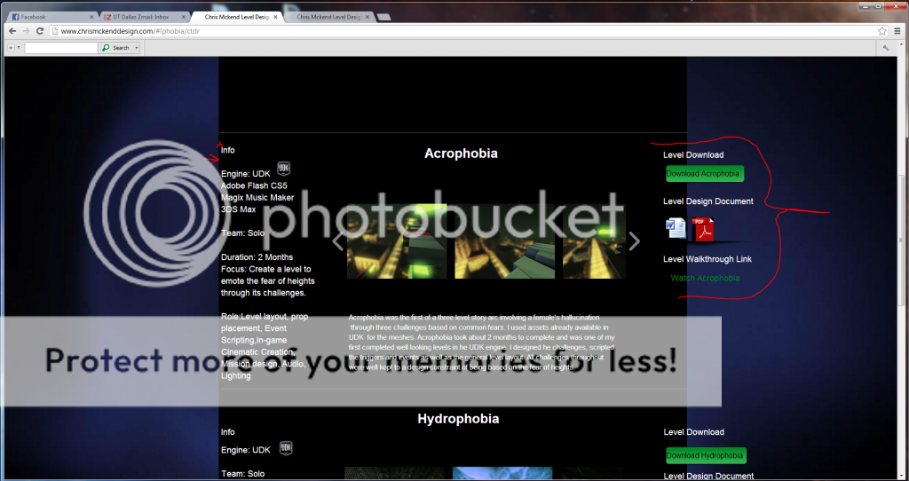
Hey Chris, I am a level designer too! I really liked your work but your portfolio needs some work! There is a lot of elements hanging outside of your content area and it looks really bad. You want to correct this problem ASAP!
Not entirely sure what is up with these "folds", even though they aren't a huge problem they do catch the users eye and make them question why they are there. On a side note, being a level designer I know we create large beautiful spaces, especially with Unreal, so you should show it off! --
|
||
| Feb 6 2013 Anchor | ||
|
Thanks alot ShiftedDesign I really appreciate you taking the time to critique my portfolio |
||
|
|
Feb 11 2013 Anchor | |
|
Well if you look a the information on any of the projects it is right up against the left edge, push it out a little bit so it doesn't look so clustered. Also, nice fixes, it's looking good so far! --
|
||
| Feb 11 2013 Anchor | ||
|
Thank you, I tried taking as much critique into account as possible. But I was wondering as for homepages, can you show me a good example or what idea would work well? |
||
|
|
Feb 12 2013 Anchor | |
|
Well there are many ways you can do a homepage, on my portfolio I did high res images on a scroll, that takes up the entire background of the page. Ianowen.net Here is an example similar to yours: Mattchamper.com You just need to fill it up some more, it's too empty currently. --
|
||
| Feb 15 2013 Anchor | ||
|
Thanks, I just got your post and was thinking |
||
Only registered members can share their thoughts. So come on! Join the community today (totally free - or sign in with your social account on the right) and join in the conversation.


