| Posts | ||
|---|---|---|
| Judge my "Portfolio" | Locked | |
| Thread Options | ||
|
|
Nov 5 2011 Anchor | |
|
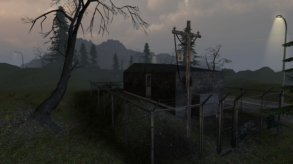
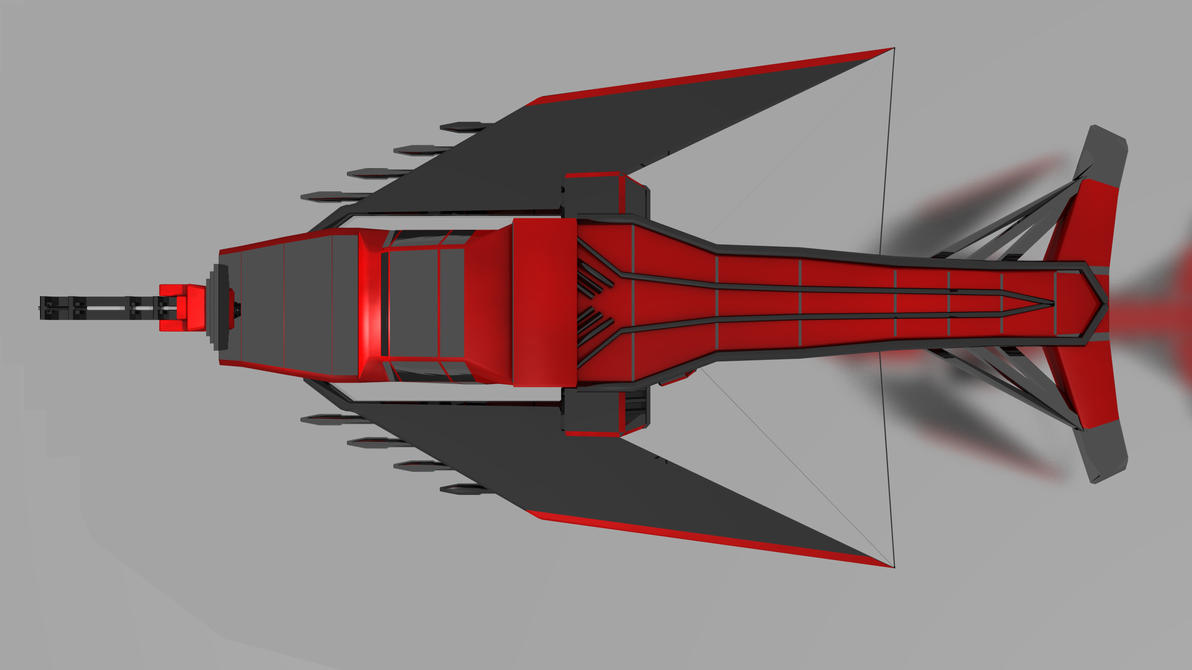
I've assembled a couple of images on the maps, props, and other stuff I've done in the past. I'd like your opinion on the quality of my work. Here we have a basic highway side building, more of an ambiance showoff than a geometry. Here is a gunship model, again modeled in blender. Edited by: senntenial |
||
| Nov 5 2011 Anchor | ||
|
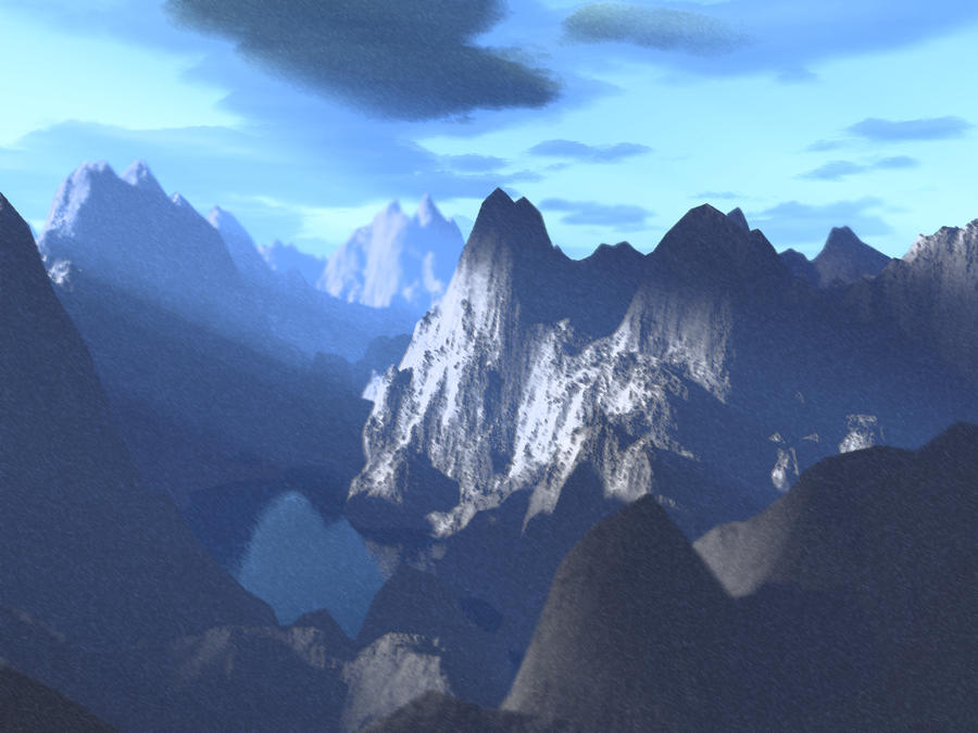
I would say, texture the gunship model with more realistic textures (panels, worn out parts etc.) and also work more on the mountain scene, because they are quite low-poly, alas the pointy, sharp sides and the top of the mountain (nice drawing skills though) Also in the Jungle map (5th image) the metal panels are going into rocks.. Nice portfolio, but i wouldnt use it profesionally, fix it up, bring it up a notch and youll have a great portfolio Edited by: Flash112 -- Think It. Sketch It. Create It. Repeat. |
||
|
|
Nov 5 2011 Anchor | |
|
you do have some cool stuff in there but overall they suffer from being very badly photographed. Try reading a few article about photo composition ( it will enhance your screenshot greatly) here's what I think about every picture: carefull tho before reading I'm being very nitpicky so keep that in mind but I wouldnt use this as a professionnal portfolio before you fix a few thing. 2nd: remove the light ray they are a distraction and tend to distract the eye away from your model. .. why does he look blured? (bad lighting !?) 3rd: meh... kinda boring to look at... what exactly are you trying to show... try something like this : 4th: I like the lighting but I dont like whats going on on thr front ,... too blurry and theres way too much film grain. 5th: yet again, badly composited and feel really empty... what are you trying to show? 6th: whats going on the tent on the rear? you have a problem with the shadow? who cares... fix it with photoshop and what are those barrel doing in the composition? what's their purpose? about the video I really do like what you're trying to build but I would work on the lighting... all those flasy colors should emit something in this dark world. keep working hard |
||
|
|
Nov 5 2011 Anchor | |
|
Heh, I'm 15- Certainly not a professional portfolio. I was trying more to give a sense of my technical ability Edited by: senntenial -- What's a signature? |
||


 This is a map I'm currently in the process of making for the mod Fall Of Saigon. Note that the Palm trees and Bamboo were not made by me, but the other leafy plants are mine, created in blender from an original texture.
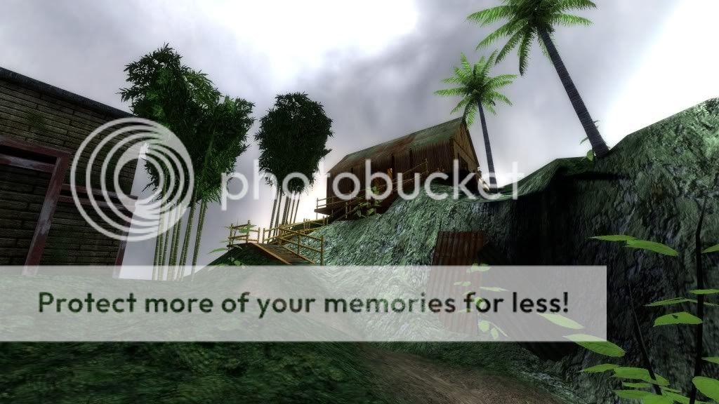
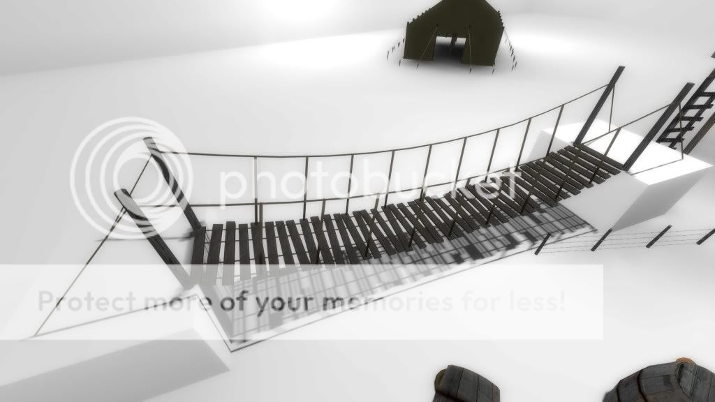 Also notice the tent I have made.


Only registered members can share their thoughts. So come on! Join the community today (totally free - or sign in with your social account on the right) and join in the conversation.